For the progression of my continuing t-shirt project, we have to design/decide a brand name, logo and strap line as well as the actual t-shirt designs. I’ve looked into several brands relevant to my own brand, relevant in both designs on their t-shirts but also in what sort of area of fashion I wish my brand to be in. This area of fashion is street/skate-wear. By researching and evaluating these logos and brand names, I will hopefully be able to decide on a suitable brand name and logo for my own project.
hype – I really like the font and calligraphic style of this brand, however I’m not so keen on the actual name itself. I feel it is a word that has been over-used as of recent. I will therefore try to make my brand name as original as possible.
HUF – I really like the style of font, simple and quite geometric. I also think the white on a green square works well as a recognisable logo. Colour and font style is something I will focus on for the aesthetics of my brand name and strap line.
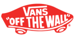
Vans – I really like the block-like text of the actual brand-name combined with a coherent strap line and skateboard shaped outline all ties in with the fact that Vans is a skateboarding brand. This makes it obvious to those who buy into the brand and what Vans was originally intended for and what they stand for as a company. This obvious use of imagery and text allows people across the world to recognise the brands intention. Making a logo and strap line so obvious and coherent to the intention of their products is something I will focus on.
Only – This is one of my favourite logos featured as I feel the extreme simplicity and monochromatic colour palette works well with a basic brand name. Whilst the brand name is basic, it gets its point across. Only is the only brand. The only brand you should be interested in and wearing. This is an example of why branding is so important, one word can make a brand by getting its point across in just that one word. I will consider carefully on using one word as my brand name as one word can get your point across without over-complicating things unnecessarily.
Supreme – I’m not so keen on this particular logo due to it being not so creative and interesting as some of the other logos. However the colour palette compliments the brand-name and the message they want to get across. The colour palette of black, red and white provides strong block colours with connotations of powerful meanings. The vibrant red has connotations of power, the black is a classic sleek and ‘expensive’ colour and the white, a pure colour. This combination of colour makes the consumer think of the brand as sleek, noticeable and make the wearer appear like they can afford more expensive clothing. This focus on colour for a logo is an aspect I could focus on for my own logo.
Volcom – I really like the combination of a brand-name and logo, both stylised in the same way so you can recognise both parts when separate as the same company. I also think the monochromatic colour palette works well as it is quite simple, but the symmetric logo with black and white used opposite each other works well as is quite eye-catching.
The Quiet Life – I really like the actual brand-name for this company as I think it is both memorable and very different to a lot of brand-names. However I’m not so keen on their latest logo version. They have had other variations of the aesthetic of the logo, but I do not think this works that well. This is due to the fact of it being quite simple in design so I dont find it very noticeable or striking. The only reason you would recognise the particular brand is because the name is clearly stated in the logo. After analysing this logo I have been able to find more reason why I want my logo and brand name to be striking and memorable.
Obey – This is an example of a brand that’s name and logo has worked very successfully in the progression of their company becoming one of the most worn brands amongst young males at the moment in popular culture. The name, makes you think you must have and must wear garments from the company. The stencilled face by the artist Shepard Fairey makes the brand recognisable by vast numbers of people just from that one simple image. The design is done by the graffiti artist Shepard Fairey, the stencil design helps get across the brands message of that their garments are intended as street wear.
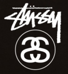
Stussy – This is my favourite brand-name and logo out of all the brands I looked into. This is because of the infamous style of font they use for the brand-name itself – a graffitti-esque font making the brand relatable to street wear, and being a skateboarding brand this is what they intended. The combination of an eye-catching brand-name and font with an interesting logo featuring the mirrored S’s which is the creators initials (Shawn Stussy) makes the brand all the more memorable. This shows if I focus on creating an interesting brand-name and logo, this can make the brand become more well known and recognisable.
We Can Be Heroes (WCBH) – I like the logo for this brand as it is relatable to their intention to be a streetwear brand, however I dont really like the name itself. This is an example of a logo working well, but not so much with the actual name.
Diamond Supply – This brand-name works really well as it is memorable but also gets their point across of their brand being a high-quality expensive brand to be seen wearing. I really like the actual logo, it is simple in its first glance, but the actual design is quite complex. This shows a complex design working so well it almost looks ‘easy’ to create. This effortless appearance of a design is a method I could focus on for my own photos, to appear simple at first glance, but when you look closely there is a lot more detail and features within the image.
After analysing several brands and logos I have been able to gather ideas of how I do and do not want my brand-name and logo to appear. For my own project I want to use a fairly simple brand-name, one worded and a simple yet interesting font style and I may or may not use a logo as well as a brand-name. To compliment my black and white images on the t-shirts, I will use just black and white for my logo/brand-name.