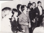
For my Melting Pot project at uni, I asked my Dad to speak to one of his Russian colleagues on behalf of myself. I asked her about 70’s Russia and the social and political issues surrounding clothing and wanting to be and individual, but being forced by the government, to be the same. The lady he asked was really lovely, she went and almost interviewed her Grandmother about the things I was so desperate to find out, first-hand from someone who was actually Russian, and lived through the time of communism in the 70’s. She sent me a mini interview from her Grandmother and several lovely and shocking images. The images are quite strange not just because of the appearance, but because of the subject. The photo’s look like their from the 30’s and 40’s due to the style of the clothing and the actual condition of the photos, in the 70’s they were still yet to join the colour film community. The clothes look almost war-time as the style is quite the same amongst the people within the photo, without it actually being a uniform, but really it might well have been. She also sent me photos from her school’s archive which are a bit spooky because of the sepia appearance and uniforms. Again the photo’s look much older than they actually are. Right! I will now copy and paste the small interview and photos.
70s.
Key points which really effected on clothes’ style of that period and consumer choice were of course:
– Political system and ideology (idea of equality; it was inappropriate to stand out for other people but at the same time people wanted to).
– Socio-economic factors (closeness for import; pure local production in terms of design and variety; low income level)
Variety of clothes in shops was really poor in terms of design, colors, cloth or textile and texture. The choice was really bad especially in Russia regions. All children went to school uniformed. Grandmother mentioned that all clothes which were available at stores were of dead colors, looked really boring and monotonous. So that was really cool if someone gets a suit made of unusual for that time material with texture, pattern or tracery.
As a result courses of cutting out and sewing had become rather popular that time. Grandmother said that in every family she knew there was somebody who could sewing clothes at home. There were not so many lifestyle or design magazines in USSR that time J. So they could study some basic schemes for cutting of at courses. Also a lot of women could knit and crochet.
Another deficit was with materials and threads, choice was poor as well. If someone gets a chance to get to foreign country – they used to it to buy some things or materials or threads. And all these things were really different from ones’ available in Russia. It was very cool that time.
Almost all things represented at stores were produced locally in Russia (One of main factories that time was in Leningrad (Saint Petersburg). Textile industry was developing well some clothes was producing locally at textile mile of Yaroslavl.