
 Here is my final moodboard, representing a selection of designs available on my spreadshirt shop. I feel this moodboard fully encapsulates my brands’ identity for this project at uni. Whilst these varied designs are available on my spreadshirt page, when I finally create a bigcartel website, not all the designs will be available instantly as I will begin with t-shirts featuring just the initial photographs. Im very pleased with how the designs turned out as they are all what I had visualised them to be. I feel the style of font combined with the background image and t-shirt designs will appeal to my mainly male aged from 19-28 audience, but who are also conscious about trend and fashion, but also aware of smaller independent brands. I have thoroughly enjoyed this project and will continue to build this brand for my own project.
Author Archives: hollyshysteria
Final Four.


These are the final four images I will use for my first range of tshirt designs (to be put on my own website not part of the uni project). I feel these images are the strongest and most interesting, but also portray my brands’ message in just four images. They are quite different and memorable which is another reason why I chose these images to be printed and then sold on my website, which I will soon be setting up.
For my uni project I will upload a minimum of eight designs to spreadshirt as this was part of the project specification.
Distort Moodboard.
 sHere is my Distort mood-board, I included some of my favourite images from the film, a colour palette, tag ideas, templates and my muse to convey my ideas and brand ethos. This is simplicity, focus on abstract black and white photos and a graphic aesthetic of the logo and tags.
2nd and 3rd film rolls.


Here is just a gallery of the best shots from my 2nd and 3rd rolls of film I used for this project, I will select a few of my favourites to use on my t-shirts. I will analyse these few in my next post.
First Roll of film.
-

- Contact Sheet


-

- Corridor
-

- Curved Lines
-

- Dancing Light

-

- Haunted Stairs
-

- Metal Stairs


-

- Warped Light


-

- Gradient
-

- Twisted Wire

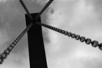
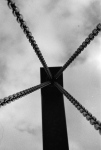
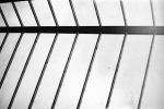
Here are my favourite shots from the first roll of film I used. Whilst I like all of them I will only include a couple in my first collection. The ones I am considering for my first collection are all those which are named. I will list the named photos and what I find interesting about them, which makes them suitable for my collection.
Corridor – The obscured focus on light in different areas. The angle of the corridor.
Curved Lines – The out of focus white lines and the wispy ‘smoke’ effect.
Dancing Light – I was testing the shutter speed of my camera to see if I could capture an interesting effect with the streetlights. The ‘dancing’ effect of the light is very interesting and almost pattern-like.
Haunted Stairs – The different tones of grey on the stairs, the light in the left top corner and blackness at the top of the stairs create an abstract and ‘haunted’ appearing photo.
Metal Stairs – The heavy contrast between the light-toned metal stairs and the dark background.
Warped Light – The obscured light movement.
Gradient – The extreme contrast between the black and white, but also the gradient-like effect from shadow.
Twisted Wire – The close up on the twisted white wire, with the bricked background. The mix of textures.

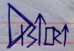
Distort.
The final image for my brand name.
Lets Brand This B*tch.
-

- Template for other designs, but also the logo I will use for my brand.

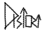


Due to researching so many brands, both fashion and non-fashion, I have been able to clarify how I want my logo and brand-name to appear. I decided to go the the brand name Distort. This singular word compliments the abstract photos which will be featured on my t-shirts, but also because the name is one word, this compliments my theme of simplicity and not over-complicating things.
After the logo research I decided that I wanted the logo to be black and white, graphic, and get my brands’ message across. This message is simplicity and abstraction. I sketched out several designs using the word Distort to help decide what aesthetics I liked the most. This angular and somewhat obscure final design I chose to go with, is relevant to all the aspects I wanted my logo to be.
Using my iPad I used the final design as a template to create variations of the design to ensure I was completely happy with the idea I had chosen. The use of colour and texture does make for an interesting image, but I do not feel they work that well as a logo. I want the logo to be simple, blunt and not easily forgotten. Any use of colour and different textures may distract attention from the brands’ name.
By creating these variations of the logo, I have been able to decide that it is my original simple design that I intend to use. I think it looks professional, interesting, memorable and suitable for the subject content of my images.
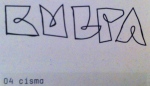
The Rise of Distort.
-

- First logo sketches

-
- Favourite design
-

- Image logo ideas
After researching several logos, both fashion and un-fashion related, I started to sketch my own designs and ideas. I want my design to be quite geometric and abstract to coincide with my abstract and often geometric images. I want my design to be black and white to relate to my photographs and my theme of simplicity until you analyse the image further.
I like the second brand-name image better as I feel it is more distorted and overall more interesting aesthetics. The last image containing to small pictures are possible ideas for a logo to accompany the brand-name. I’m not yet sure if I want to just use the brand-name as the logo itself, or include a small image as well.
The small camera represents the use of photography for the brand, the other represents stairs, which I often photograph to create interesting abstract and geometric photos. I’m not yet decided if I should use a logo as well as a brand-name to be featured on my tshirts. After drawing out some more logos using Adobe Illustrator and Procreate on my iPad I will hopefully decide on one design.
Logo moodboard.


This mood board features images from the book ‘Tres Logos’ edited by Robert Klanten. I looked through entire book and found my favourite logos and designs and included the ones which I thought were relevant to the creation of my own logo. The font types and styles of the logos will help inspire ideas for my own. This research will help me discover what kind of logos are already out there, and to prevent designing a similar to one that currently exists.
Sexy Logos.


For the progression of my continuing t-shirt project, we have to design/decide a brand name, logo and strap line as well as the actual t-shirt designs. I’ve looked into several brands relevant to my own brand, relevant in both designs on their t-shirts but also in what sort of area of fashion I wish my brand to be in. This area of fashion is street/skate-wear. By researching and evaluating these logos and brand names, I will hopefully be able to decide on a suitable brand name and logo for my own project.
hype – I really like the font and calligraphic style of this brand, however I’m not so keen on the actual name itself. I feel it is a word that has been over-used as of recent. I will therefore try to make my brand name as original as possible.
HUF – I really like the style of font, simple and quite geometric. I also think the white on a green square works well as a recognisable logo. Colour and font style is something I will focus on for the aesthetics of my brand name and strap line.
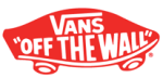
Vans – I really like the block-like text of the actual brand-name combined with a coherent strap line and skateboard shaped outline all ties in with the fact that Vans is a skateboarding brand. This makes it obvious to those who buy into the brand and what Vans was originally intended for and what they stand for as a company. This obvious use of imagery and text allows people across the world to recognise the brands intention. Making a logo and strap line so obvious and coherent to the intention of their products is something I will focus on.
Only – This is one of my favourite logos featured as I feel the extreme simplicity and monochromatic colour palette works well with a basic brand name. Whilst the brand name is basic, it gets its point across. Only is the only brand. The only brand you should be interested in and wearing. This is an example of why branding is so important, one word can make a brand by getting its point across in just that one word. I will consider carefully on using one word as my brand name as one word can get your point across without over-complicating things unnecessarily.
Supreme – I’m not so keen on this particular logo due to it being not so creative and interesting as some of the other logos. However the colour palette compliments the brand-name and the message they want to get across. The colour palette of black, red and white provides strong block colours with connotations of powerful meanings. The vibrant red has connotations of power, the black is a classic sleek and ‘expensive’ colour and the white, a pure colour. This combination of colour makes the consumer think of the brand as sleek, noticeable and make the wearer appear like they can afford more expensive clothing. This focus on colour for a logo is an aspect I could focus on for my own logo.
Volcom – I really like the combination of a brand-name and logo, both stylised in the same way so you can recognise both parts when separate as the same company. I also think the monochromatic colour palette works well as it is quite simple, but the symmetric logo with black and white used opposite each other works well as is quite eye-catching.
The Quiet Life – I really like the actual brand-name for this company as I think it is both memorable and very different to a lot of brand-names. However I’m not so keen on their latest logo version. They have had other variations of the aesthetic of the logo, but I do not think this works that well. This is due to the fact of it being quite simple in design so I dont find it very noticeable or striking. The only reason you would recognise the particular brand is because the name is clearly stated in the logo. After analysing this logo I have been able to find more reason why I want my logo and brand name to be striking and memorable.
Obey – This is an example of a brand that’s name and logo has worked very successfully in the progression of their company becoming one of the most worn brands amongst young males at the moment in popular culture. The name, makes you think you must have and must wear garments from the company. The stencilled face by the artist Shepard Fairey makes the brand recognisable by vast numbers of people just from that one simple image. The design is done by the graffiti artist Shepard Fairey, the stencil design helps get across the brands message of that their garments are intended as street wear.
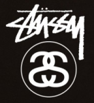
Stussy – This is my favourite brand-name and logo out of all the brands I looked into. This is because of the infamous style of font they use for the brand-name itself – a graffitti-esque font making the brand relatable to street wear, and being a skateboarding brand this is what they intended. The combination of an eye-catching brand-name and font with an interesting logo featuring the mirrored S’s which is the creators initials (Shawn Stussy) makes the brand all the more memorable. This shows if I focus on creating an interesting brand-name and logo, this can make the brand become more well known and recognisable.
We Can Be Heroes (WCBH) – I like the logo for this brand as it is relatable to their intention to be a streetwear brand, however I dont really like the name itself. This is an example of a logo working well, but not so much with the actual name.
Diamond Supply – This brand-name works really well as it is memorable but also gets their point across of their brand being a high-quality expensive brand to be seen wearing. I really like the actual logo, it is simple in its first glance, but the actual design is quite complex. This shows a complex design working so well it almost looks ‘easy’ to create. This effortless appearance of a design is a method I could focus on for my own photos, to appear simple at first glance, but when you look closely there is a lot more detail and features within the image.
After analysing several brands and logos I have been able to gather ideas of how I do and do not want my brand-name and logo to appear. For my own project I want to use a fairly simple brand-name, one worded and a simple yet interesting font style and I may or may not use a logo as well as a brand-name. To compliment my black and white images on the t-shirts, I will use just black and white for my logo/brand-name.
