
 Here is my final moodboard, representing a selection of designs available on my spreadshirt shop. I feel this moodboard fully encapsulates my brands’ identity for this project at uni. Whilst these varied designs are available on my spreadshirt page, when I finally create a bigcartel website, not all the designs will be available instantly as I will begin with t-shirts featuring just the initial photographs. Im very pleased with how the designs turned out as they are all what I had visualised them to be. I feel the style of font combined with the background image and t-shirt designs will appeal to my mainly male aged from 19-28 audience, but who are also conscious about trend and fashion, but also aware of smaller independent brands. I have thoroughly enjoyed this project and will continue to build this brand for my own project.
Tag Archives: illustration
Lets Brand This B*tch.
-

- Template for other designs, but also the logo I will use for my brand.

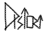


Due to researching so many brands, both fashion and non-fashion, I have been able to clarify how I want my logo and brand-name to appear. I decided to go the the brand name Distort. This singular word compliments the abstract photos which will be featured on my t-shirts, but also because the name is one word, this compliments my theme of simplicity and not over-complicating things.
After the logo research I decided that I wanted the logo to be black and white, graphic, and get my brands’ message across. This message is simplicity and abstraction. I sketched out several designs using the word Distort to help decide what aesthetics I liked the most. This angular and somewhat obscure final design I chose to go with, is relevant to all the aspects I wanted my logo to be.
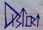
Using my iPad I used the final design as a template to create variations of the design to ensure I was completely happy with the idea I had chosen. The use of colour and texture does make for an interesting image, but I do not feel they work that well as a logo. I want the logo to be simple, blunt and not easily forgotten. Any use of colour and different textures may distract attention from the brands’ name.
By creating these variations of the logo, I have been able to decide that it is my original simple design that I intend to use. I think it looks professional, interesting, memorable and suitable for the subject content of my images.
The Rise of Distort.
-

- First logo sketches

-
- Favourite design
-

- Image logo ideas
After researching several logos, both fashion and un-fashion related, I started to sketch my own designs and ideas. I want my design to be quite geometric and abstract to coincide with my abstract and often geometric images. I want my design to be black and white to relate to my photographs and my theme of simplicity until you analyse the image further.
I like the second brand-name image better as I feel it is more distorted and overall more interesting aesthetics. The last image containing to small pictures are possible ideas for a logo to accompany the brand-name. I’m not yet sure if I want to just use the brand-name as the logo itself, or include a small image as well.
The small camera represents the use of photography for the brand, the other represents stairs, which I often photograph to create interesting abstract and geometric photos. I’m not yet decided if I should use a logo as well as a brand-name to be featured on my tshirts. After drawing out some more logos using Adobe Illustrator and Procreate on my iPad I will hopefully decide on one design.
Logo moodboard.


This mood board features images from the book ‘Tres Logos’ edited by Robert Klanten. I looked through entire book and found my favourite logos and designs and included the ones which I thought were relevant to the creation of my own logo. The font types and styles of the logos will help inspire ideas for my own. This research will help me discover what kind of logos are already out there, and to prevent designing a similar to one that currently exists.

‘Ricki F*ckin Hall’
Trying to think of a suitable muse for my brand seems almost impossible. I want the muse to be alternative in appearance, but also have an interesting personality that shines through both his style and interests. I stumbled across this … Continue reading
